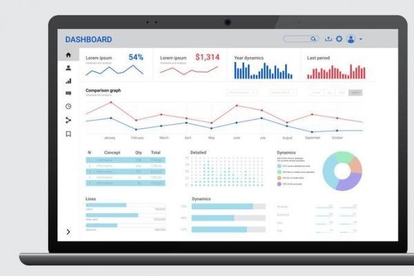
Most business dashboards are where data goes to die. Beautiful charts, updated daily, looked at never. The best AI for business dashboards in 2026 fixes the actual problem — not prettier charts, but answers. Instead of staring at twelve graphs wondering what changed, you get told what changed, why it probably changed, and what to look at next. The question we answer here: what is the best AI for business dashboards.
I’ve set up dashboards for small businesses that got checked religiously and dashboards that became expensive wallpaper. The difference was never the tool. It was whether the dashboard answered a question someone actually asks on Monday morning.
What is the best AI for business dashboards?
What “AI dashboard” means now
The term covers a few different things, and it’s worth knowing which you need:
- Natural-language querying: Type “why did revenue dip last Tuesday?” and get an answer with the supporting chart, instead of building the query yourself. This is the single biggest usability leap in business intelligence in a decade.
- Automated insights: The dashboard watches your metrics and flags anomalies — a sudden drop in conversion, an unusual spike in refunds — with a plain-English explanation of what moved.
- Auto-generated dashboards: Connect your data sources and AI proposes a dashboard layout based on your industry and role, which you then refine. Great starting point, terrible finishing point — always customize.
- Predictive overlays: Not just “here’s what happened” but “here’s where this trend lands you by quarter-end.” This shades into AI financial forecasting for SMBs, and the line between dashboard and forecast is blurring fast.
The tools worth shortlisting
For teams already on a BI platform
If you use Power BI, Tableau, or Looker, check the AI features before buying anything new — all three have added natural-language query and automated insight generation. The 2026 versions are genuinely usable, not demos. The advantage of staying put: your data connections and permissions already exist.
For small businesses starting fresh
You probably don’t need a BI platform. Modern lightweight tools connect to Stripe, Shopify, Google Analytics, your ad accounts, and your spreadsheets, then give you a conversational interface over all of it. The pitch is “ask questions about your business in English,” and for standard metrics it actually works. Pricing is usually per seat or per data source — model it against how many people will really log in.
For spreadsheet natives
If your business runs on Google Sheets or Excel, AI for Excel and Sheets add-ons can turn a well-organized spreadsheet into a quasi-dashboard with natural-language queries. It’s less powerful than a real BI tool and far cheaper and faster to set up. For businesses under ~50 people, this is often enough.
How to build a dashboard people actually use
Here’s my hard-won process:
- Start with decisions, not data. List the five decisions you make repeatedly — pricing changes, ad spend shifts, hiring, inventory orders. The dashboard exists to serve those.
- One screen, five numbers. If it doesn’t fit on one screen without scrolling, it’s a report, not a dashboard. The five numbers should be the ones that make you act.
- Add context to every metric. A number without comparison is decoration. Every KPI needs its prior period, its target, or both.
- Let AI do the commentary. This is where AI dashboards earn their keep — automated plain-English summaries of what moved and why, delivered to Slack or email. The dashboard becomes the place you verify, not the place you discover.
- Kill ruthlessly. Review quarterly. Any chart nobody acted on in three months gets deleted. Dashboards accrete clutter like closets.
Watch out for these traps
AI-generated insights can be confidently wrong — always spot-check a surprising finding against the raw data before acting on it. Data quality matters more than ever: an AI happily analyzing a broken tracking setup will produce beautiful, authoritative nonsense. And be careful with access — natural-language query over everything means anyone can ask about anything, so get your permissions right.
The Monday-morning test
Here’s how you know your dashboard works: on Monday morning, you open it and within 60 seconds know (a) whether last week was good or bad, (b) the one thing that needs your attention today, and (c) whether anything looks wrong enough to investigate. If your dashboard can’t pass this test, it’s not a dashboard — it’s a data museum. When evaluating AI dashboard tools, run this exact test during the trial: connect your real data, open it Monday morning, and time yourself. The tools that pass are worth paying for; the ones that show you twelve beautiful charts and zero conclusions are expensive wallpaper. And revisit the test quarterly — dashboards drift toward clutter as people keep adding “just one more metric.” The 60-second rule is the permanent defense.
The endgame here is worth picturing: a Monday morning where your dashboard has already noticed the weekend’s anomaly, drafted the explanation, and suggested the two metrics to watch. You spend fifteen minutes verifying instead of two hours hunting. That’s what the best AI business dashboards deliver in 2026 — not more charts, but fewer mysteries. Pair it with the ability to analyze customer reviews at scale and you start getting the “why” behind the numbers, which is the part dashboards could never give you before.