A logo used to cost $500 and two weeks. Now AI generates 50 options in 50 seconds, free. So what is the best AI for generating logos in 2026 — and the harder question: are any of them actually good enough to represent your business? I’ve generated hundreds of AI logos and watched real businesses adopt them. Here’s the unvarnished truth.
What is the best AI for generating logos?
The honest quality assessment
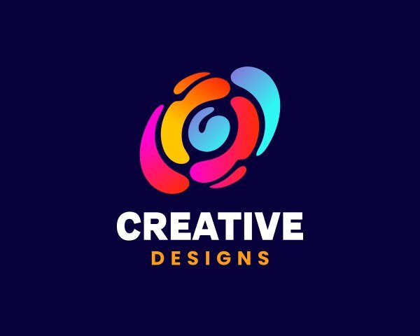
AI logos in 2026 are genuinely good at: clean geometric marks, wordmarks with interesting typography treatment, abstract symbols, and endless variations for exploration. They’re genuinely bad at: intricate detail that survives small sizes, truly original concepts (everything looks like everything else after a while), and the strategic thinking that makes great logos great. The median AI logo today looks professional and forgettable — which, depending on your needs, might be exactly fine.
The tools, by approach
Dedicated AI logo generators
These walk you through industry, style preferences, colors, and symbols, then generate coordinated sets — logo, variations, mockups on business cards. Their advantage is the system: you get a usable brand kit, not just an image. Quality varies enormously between platforms; the best ones produce vector outputs (SVG/EPS) — non-negotiable for real use, since you need scalability for print, signage, and embroidery. Raster-only (PNG/JPG) output is a toy, not a logo.
General image generators
Midjourney, DALL-E, and friends produce more distinctive, artistic marks than logo-specific tools — but with critical limitations: text rendering (better than it was, still unreliable for wordmarks), no vector output, and no brand system. Great for exploring directions and generating the concept; you’ll need a designer (or vectorization plus cleanup) to make it production-ready. You can use DALL-E for free to experiment before spending anything.
The hybrid workflow (my recommendation)
Generate 30-50 concepts with AI for exploration → pick 3 directions → refine the winner with a designer or careful vector work → build the full lockup system (variations, spacing rules, color specs). You get AI’s breadth and human craft’s finish. Total cost: a fraction of traditional branding, with 80% of the quality for most small businesses.
The trademark problem nobody mentions
This is the serious part. AI models trained on millions of images can produce marks uncomfortably similar to existing logos — and “the AI made it” is not a defense against trademark infringement. Before adopting any AI logo: run a trademark search in your jurisdiction and classes, check domain and social handle availability, and consider that truly distinctive marks are easier to protect than generic ones (another point for human refinement). For any business with real ambitions, a few hundred dollars of attorney search time is cheap insurance against a rebrand demand later.
When AI logos are perfect (and when they’re not)
Perfect for: side projects, MVPs, internal tools, AI side hustles testing ideas, businesses where the logo barely matters (most B2B services — clients buy competence, not marks).
Not enough for: consumer brands where identity is the product, companies planning to trademark aggressively, anyone in fashion/luxury/food where the mark carries emotional weight. These deserve human designers — and the best designers now use AI in their process anyway, so you’re not choosing between AI and craft, you’re choosing where the craft gets applied.
Making an AI logo that doesn’t look AI-generated
- Constrain the style hard. Vague prompts produce generic output. Reference specific design movements, eras, and constraints.
- Design the system, not the image. A logo is one asset; a brand is the logo plus typography, color, spacing, and usage rules. AI gives you the asset; you build the system.
- Test at 16 pixels. If it’s not legible as a favicon, it’s not a logo — it’s an illustration. Simplify until it survives.
- Sleep on it. AI logos have a “wow, that looks professional” effect that fades. The ones you still like after a week are the keepers.
The file-format checklist (non-negotiable)
Before accepting any AI logo, verify the deliverables — this is where most people get burned: vector source files (SVG, EPS, or AI format — infinitely scalable, required for print/signage/embroidery; if the tool only gives PNG, it’s not a real logo tool), multiple lockups (horizontal, stacked, icon-only versions — you need all three), color variants (full color, black, white/reversed — for different backgrounds), minimum sizes (test at 16px favicon and billboard scale — a logo must survive both), and clear background versions (transparent PNGs for digital use). A “logo” that’s just a pretty JPG is a picture, not an identity. The tools worth paying for deliver the full kit; the toys deliver a single image. Check the export options before you fall in love with a design.
The logo design world didn’t end; it bifurcated. Commodity logo production got automated (good — it was overpriced), while strategic brand identity got more valuable (also good — it was underpriced). Know which one you’re buying. And pair the visual identity with verbal identity — AI tools for copywriters can help with the taglines and brand voice to match.