
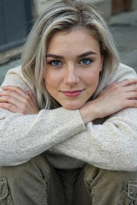
Figuring out how to make AI images not look fake is the difference between AI art that impresses and AI art that gets dismissed. We’ve all seen the tells: plastic skin, impossible hands, lighting that doesn’t quite make sense, a general airbrushed unreality. The good news is that most “fakeness” comes from a handful of fixable issues — and addressing them is a learnable skill, not magic. Here’s the complete guide.
Why AI Images Look Fake: The Core Causes
- Over-perfection. AI defaults to idealized everything: flawless skin, perfect lighting, immaculate compositions. Reality is messier, and our eyes know it.
- Lighting inconsistencies. Shadows falling in impossible directions, highlights that don’t match any light source, ambient light that feels “off.” Humans are extraordinarily sensitive to lighting wrongness.
- Texture poverty. AI skin looks like plastic because it lacks pores, fine hairs, and micro-variation. Fabrics lack weave; metal lacks scratches. Real surfaces have history.
- Anatomical errors. Hands, teeth, ears, and joints go wrong in ways our brains flag instantly — we’re hyper-tuned to human bodies. Our article on why AI messes up hands explains the technical reasons.
- Depth and physics errors. Objects floating slightly, reflections that don’t match, perspective that’s subtly wrong. Individually minor; collectively uncanny.
How to Make AI Images Not Look Fake: Prompt-Level Fixes
Half the battle is won before generation, in the prompt:
- Prompt imperfections explicitly. “Natural skin texture with visible pores,” “slight film grain,” “candid, unposed,” “asymmetrical composition.” You’re counteracting the model’s beautification bias.
- Specify real lighting scenarios. “Harsh midday sun,” “fluorescent office light,” “overcast morning” — real, specific, sometimes unflattering light reads as authentic.
- Include mundane details. Clutter, wrinkles, mess, wear. “Lived-in” beats “pristine” for realism every time.
- Use photographic language. Camera models, film stocks, focal lengths — these encode realistic optical characteristics. Our Midjourney photorealism guide (photorealistic Midjourney images) has extensive examples.
- Avoid beauty superlatives. “Stunning,” “breathtaking,” “ultra-detailed” push toward idealized rendering. Documentary language pushes toward truth.
Post-Processing: Where Good Becomes Convincing
Even well-prompted images benefit from a finishing pass. These are standard photographic treatments that bridge the realism gap:
- Add film grain. Subtle, uniform grain is the single highest-impact realism tweak. Digital perfection reads as synthetic; grain reads as captured.
- Fix the lighting in post. Dodge and burn to create coherent light direction. Add a subtle vignette. Ensure shadows fall consistently.
- Texture work. Overlay subtle skin texture where the AI smoothed it away. Add fabric weave, surface wear, environmental grime appropriate to the scene.
- Color grading. Slightly lift the blacks, pull back over-saturated colors, match a realistic white balance. AI images often have a hyper-clean color grade that feels digital.
- Chromatic aberration and lens effects. Tiny amounts of edge fringing and barrel distortion mimic real optics. Invisible when done right; powerfully convincing subconsciously.
- Repair the anatomy. Inpainting for hands, teeth, and other problem areas — our guide to inpainting fixes walks through the technique, and fixing deformed hands covers the most common repair.
Composition Choices That Sell Realism
- Candid over posed. Mid-gesture, mid-laugh, looking away — caught moments read as real; direct-to-camera perfection reads as generated.
- Imperfect framing. Slightly tilted horizons, subjects off-center, awkward crops — the accidents of real photography.
- Environmental storytelling. A half-finished coffee, an open laptop, scattered papers — lived-in scenes convince; sterile ones don’t.
- Depth of field. Shallow depth of field (blurred backgrounds) hides background weirdness and mimics real camera optics simultaneously.
The Realism Checklist
Before publishing any AI image, run through this:
- Hands, teeth, and ears — zoom in and check every one
- Light direction — is it consistent across the whole image?
- Shadows — does every object cast one, in the right direction?
- Reflections — do mirrors, water, and glossy surfaces reflect plausibly?
- Text — is any text garbled or nonsensical?
- Texture — does skin have pores, do surfaces have variation?
- Background — anything melting, morphing, or physically impossible back there?
- Overall impression — show it to someone without context; do they question it?
That last test is the ultimate one. Fresh eyes catch what yours miss after staring at generations for an hour.
Knowing When Realism Isn’t the Goal
Not every AI image should chase photorealism. Stylized illustration, concept art, surreal compositions — these are legitimate aesthetics where “looking AI” doesn’t matter because the image isn’t pretending to be a photo. The uncanny valley only applies when realism is attempted. Be intentional: either commit to full realism using these techniques, or embrace obvious stylization. The awkward middle — almost-real but slightly off — is where images fail.
For more background, see Wikipedia’s Stable Diffusion article.
The Takeaway
Making AI images not look fake comes down to fighting the model’s beautification bias at every stage: prompt imperfections and real lighting, post-process with grain and texture, compose candidly, and check ruthlessly against the realism checklist. It’s a craft — part photography knowledge, part retouching skill, part attention to detail. Master it, and your AI images stop looking “generated” and start looking made, which is a much better compliment.

1 Comment