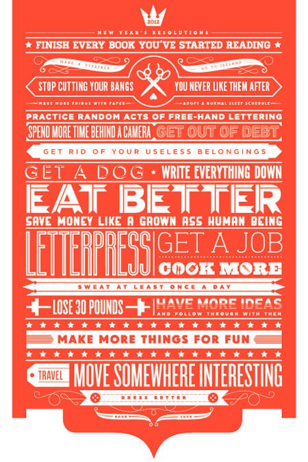
Learning how to generate AI images with readable text — posters, logos, memes, thumbnails, signage — means tackling one of AI’s most notorious weaknesses. For years, AI image generators produced gloriously garbled text: letters that looked right at a glance and dissolved into nonsense on inspection. The good news: this has improved dramatically. The better news: with the right techniques, you can now get reliably readable text. Here’s how.
Why AI Struggles With Text
Quick background: diffusion models learn visual patterns, not language. They reproduce the appearance of text — letter-like shapes in plausible arrangements — without understanding letters as symbols. It’s like someone copying Chinese characters beautifully without knowing Chinese: the shapes are right-ish, the meaning is absent. Longer text compounds the problem exponentially: each additional letter is another chance for the pattern-matching to drift. (The same root cause as the hand problem — our article on why AI messes up hands explores the pattern-vs-understanding gap.)
How to Generate AI Images With Readable Text: What Works Now
1. Use models with text rendering capabilities
The single biggest factor. Recent model generations (DALL-E 3, Ideogram, newer Stable Diffusion variants, recent Midjourney versions) have dramatically better text rendering than their predecessors — some handle short phrases nearly perfectly. If readable text is your priority, model choice matters more than prompting tricks. Ideogram in particular built its reputation on text accuracy; it’s worth trying specifically for text-heavy designs.
2. Keep text short
The reliability curve drops steeply with length: 1–3 words are highly reliable on modern models, short phrases (4–8 words) usually work, sentences are risky, paragraphs are fantasy. Design around this constraint: big impactful headlines render fine; body copy doesn’t. Plan your layouts with short text elements and add longer copy in post-production.
3. Quote text explicitly in prompts
Put the exact text in quotation marks within your prompt: a vintage poster with the text "SUMMER FESTIVAL" in bold letters. Specify the text exactly as it should appear, including capitalization. Some models respond to emphasis: the text "OPEN" written clearly and legibly. Be literal — the model isn’t inferring your intent.
4. Specify typography
Describe the lettering: “bold sans-serif typography,” “elegant serif lettering,” “hand-painted sign lettering,” “neon sign text.” Typography descriptors help the model render letterforms more deliberately. Also specify placement: “text centered at top,” “large title text across the middle” — positional clarity reduces garbling.
5. Generate text and image separately, then composite
The professional workflow for critical text: generate the image with AI, add the text yourself in Photoshop, Canva, or Figma. This guarantees perfect typography with full control over fonts, kerning, and layout. AI handles what it’s good at (imagery); you handle what requires precision (text). For client work, thumbnails, and anything where text accuracy is non-negotiable, this hybrid approach is the standard — not a compromise.
Use-Case Playbook
- YouTube thumbnails: 2–4 words max, huge, high contrast. Modern models handle this reliably. Generate background and text together, or composite text for guaranteed punch.
- Posters and flyers: generate the artwork, add all text in design software. Full typographic control, zero garbling risk.
- Memes: short top/bottom text works natively in current models. Keep it brief and punchy.
- Logos with text: generate the icon/symbol with AI, add wordmarks manually. Logo text must be pixel-perfect — never trust generation for final logo lockups.
- Signage in scenes: (“a storefront with a sign reading…”) — works for short signs on modern models; keep the sign text to 1–3 words and verify by zooming.
- Book covers: artwork via AI, title and author name added manually. Non-negotiable for professional publishing.
Troubleshooting Garbled Text
- Regenerate with simpler text. If “GRAND OPENING SALE” garbles, try “SALE” — then add the rest manually.
- Increase text size in the composition. Larger text = more pixels per letter = better rendering. “Small text on a distant sign” fails; “huge billboard text” succeeds.
- Reduce scene complexity. Busy scenes degrade text quality. Simpler backgrounds, better text.
- Try inpainting for text fixes. Mask the garbled text region and regenerate just that area with explicit text prompts — our inpainting guide (inpainting guide) covers the technique.
- Know when to composite. If you’ve regenerated five times and the text still garbles, stop fighting the tool. Five minutes in Canva beats fifty generations.
How Text Rendering Will Keep Improving
The trajectory here is encouraging: each model generation handles text meaningfully better than the last. What’s coming: reliable multi-line text, better typography control (specifying fonts by name), text that follows curves and perspectives naturally, and eventually full poster layouts generated in one pass. But the hybrid workflow — AI imagery plus human typography — will likely remain the professional standard for a long time, because typography is a precision craft where “close enough” isn’t good enough. Learn both: native generation for speed, compositing for quality.
For more background, see Ideogram’s AI image generator.
The Takeaway
Readable AI text is achievable: choose text-capable models, keep text short and explicitly quoted, specify typography, and — for anything critical — composite perfect text onto AI imagery manually. The technology improved enormously, but the hybrid workflow remains the professional standard for a reason: it combines AI’s visual strengths with your typographic precision. Design with the constraint in mind rather than fighting it, and text becomes a feature, not a flaw.